Case Study
Design Sprint
Flair
Expressing gender identity, one outfit at a time.
Roles
UX Designer
UX Researcher
Full-Stack Designer
Timeline
48 hours (May 17 – 19, 2024)
Team
Alexis Chew
Richie Sarinana
Owen Payton
Awards
UCI Designathon 2024, 2nd Place
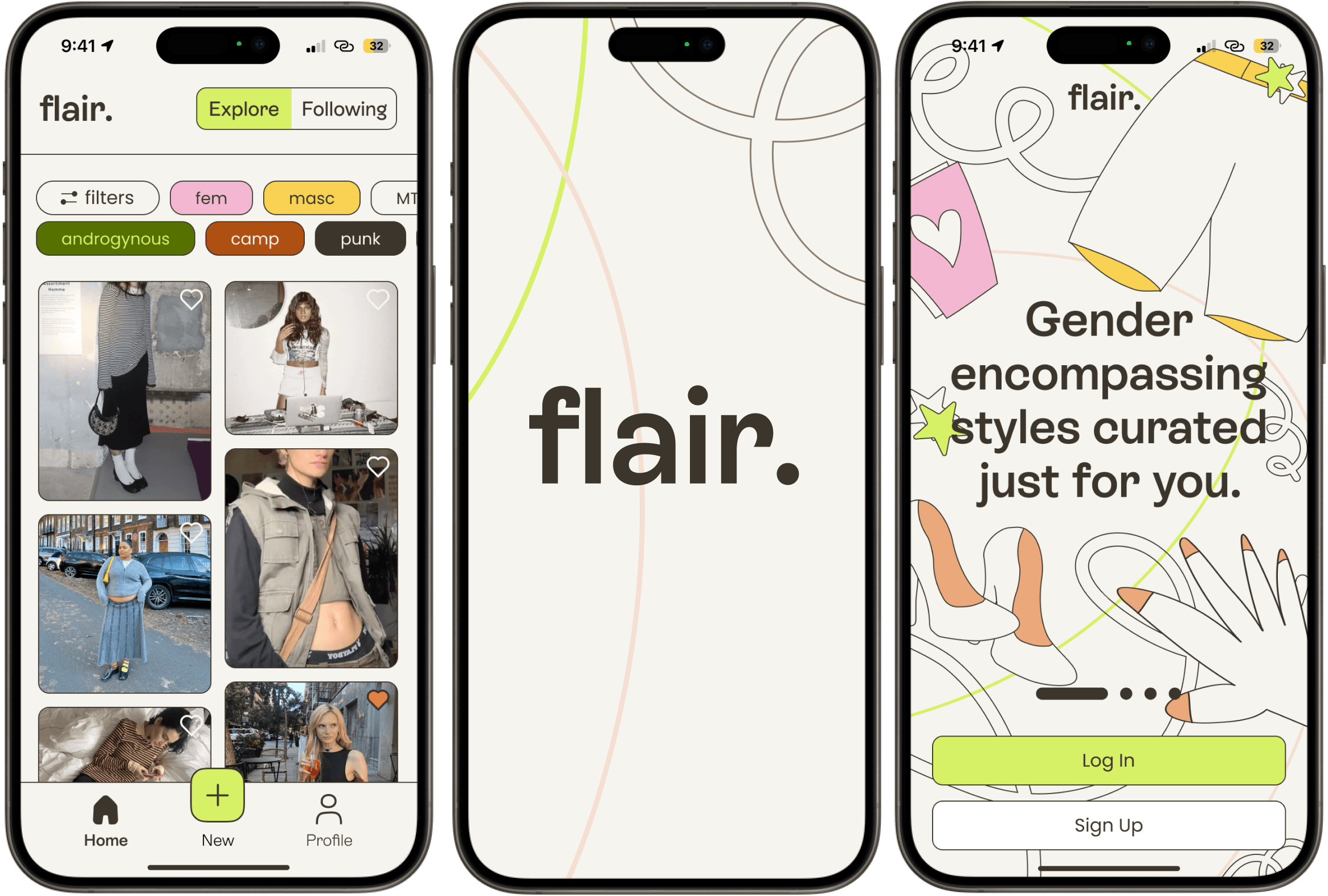
In Spring 2024, I participated in UC Irvine's annual Designathon, where the design prompt challenged us to create an app that fosters creative expression for a more inclusive society. Our team's solution, Flair—a fashion app for transgender and genderqueer identities—stood out among over 200 competitors, earning us 2nd place.
The Context
For many transgender and genderqueer individuals, fashion is way more than just clothing—it's a vital expression of their identity and a way to navigate the world.
Yet, finding clothing that truly resonates with their sense of self can be challenging in a landscape dominated by heteronormative standards.
This project was born from our shared experiences in the queer community and the struggle to find fashion spaces that truly celebrate and affirm our identities.
The Problem
How can we empower transgender and non-binary individuals to explore and express their identities through fashion in a safe and affirming digital space?
The broad, no-brainer goals that guided our design
Emphasis on inclusivity-forward representation.
Discouragement of bigotry and discrimination.
The Research
Understanding our users and the problem space
Research Procedures
We listened to 20+ genderqueer people… and their frustration is undeniable
Through 25 user surveys and 3 user interviews, we received input from people from all across the queer gender spectrum to learn more about their experiences and challenges with finding fashion inspiration, how their fashion goals relate to their identity, and what features they would search for in our application.
User Survey Statistics
After quantifying grievances, we find that…
76%
struggle to find accurate brand, price, or availability of products
64%
struggle with where to start when exploring new styles
80%
want to document outfits over time & track their evolving style
User Interviews
A conversation with three trans people
Here are the common behavioral patterns we identified:
Frustrated by: A lack of trans-inclusive fashion platforms, along with algorithms that fail to protect against transphobia, making it harder to find affirming clothing and leading to user disengagement.
Motivated by: The desire to express their evolving identities through gender affirming clothing and connect with a likeminded community.
"One time I opened up a magazine site and it straight up crashed my browser. I just didn’t bother trying again."
"Don’t be boring! Nowadays, every website is so obviously a template."
Research Synthesis
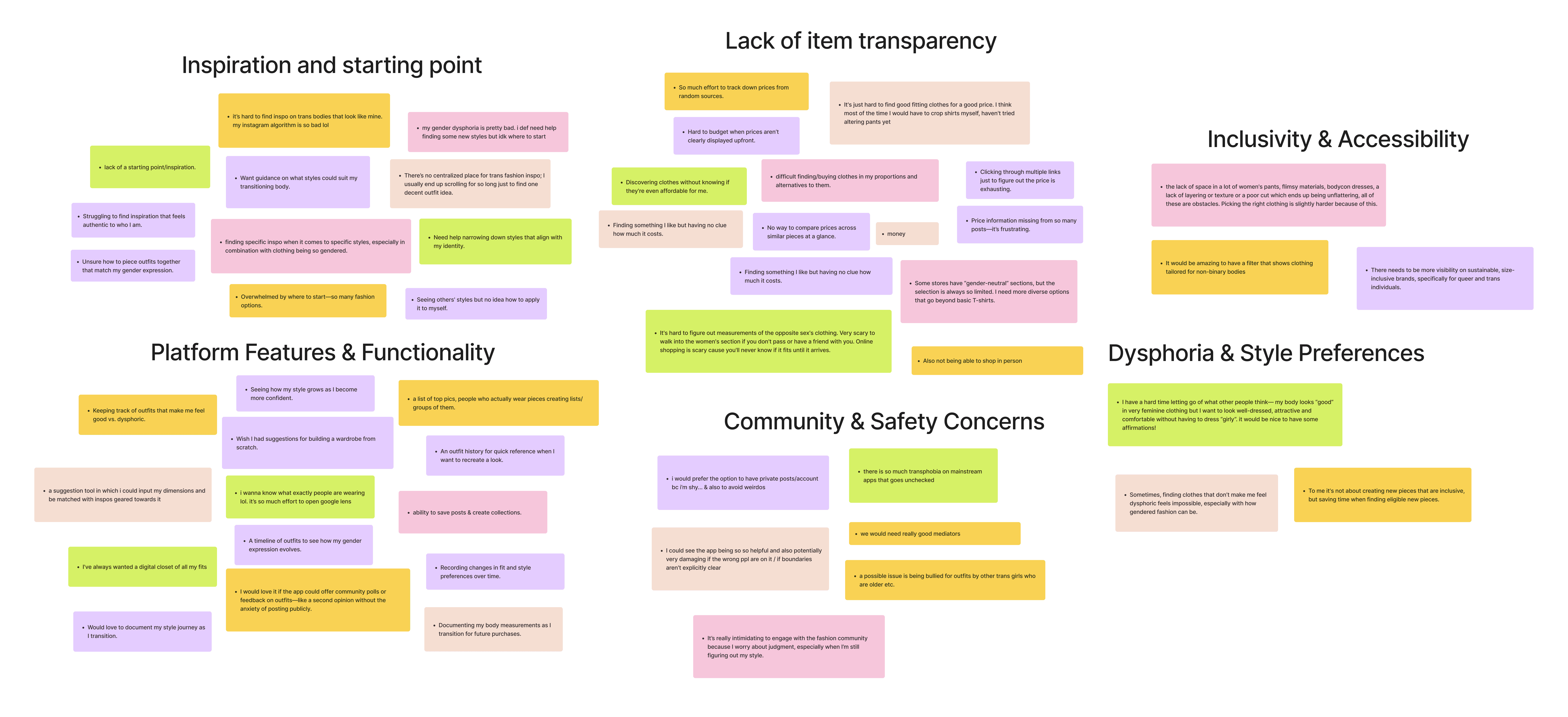
Sorting through the notes, quotes, observations, and research data by creating an affinity map.
Secondary Analysis
Currently, there isn't an efficient solution
One of the main platforms for fashion inspiration is Instagram: a popular but algorithm-driven platform that often overlooks queer and trans fashion. Analyzing competitors revealed that mainstream apps prioritize reach over inclusivity, leaving trans users without tailored experiences.

Competitive analysis on similar apps used for queer fashion discovery.
Summary
Key insights… much to think about!
Challenges in Finding Affirming Clothing
Trans and genderqueer individuals struggle with limited inclusive options along with a lack of price and product transparency, making it difficult to find clothing that truly reflects their identity.
Lack of Inspiration and Starting Points
Users often feel lost when exploring new styles, lacking clear guidance or resources to help them begin their fashion journey.
Unsafe and Unwelcoming Mainstream Platforms
Unchecked transphobia and a lack of tailored experiences on mainstream platforms lead to disengagement and frustration, leaving users without safe, affirming digital spaces.
The Design
Encapsulating our research into a streamlined experience
User Journey Map
Mapping the user flow
Based on the research, trans and genderqueer individuals prioritize product and style discovery along with outfit documentation. Thus, the main processes of the user journey consist of a personalized onboarding process, then viewing a product, creating a post or collection, and viewing your timeline or collections.

A user flow diagram documenting the core features and pages of the app.
Low Fidelity Wireframes
Starting from square one
I narrowed in on the home, profile, and post screens at this stage and wanted to gather external feedback early. I asked users to navigate the prototype with guidance to observe:
Whether the layout felt intuitive
If there were features or information they thought were lacking
How they felt navigating the screens

Takeaways
Positive: The overall layout was received well and users said that it seemed intuitive.
Negative: Users didn't like the multiple options in the navbar and would prefer something simpler and more straightforward. The amount of options was overwhelming, especially in a new app environment.
Thus, we decided to opt for a simpler navbar design. Talking to our testers, they informed us that fewer options meant the app felt cleaner and less daunting.
Before
After
Branding and Design System
A playful approach to fashion
Drawing inspiration from soft, pastel tones reminiscent (but not too on the nose) of pride flag colors, we crafted an accessible design system that feels welcoming, playful, and positive. The color palette sets a light-hearted mood, while the copy is affirming, casual, and encouraging.
Click arrows or swipe to navigate carousel
Design system colors, typography, and assets
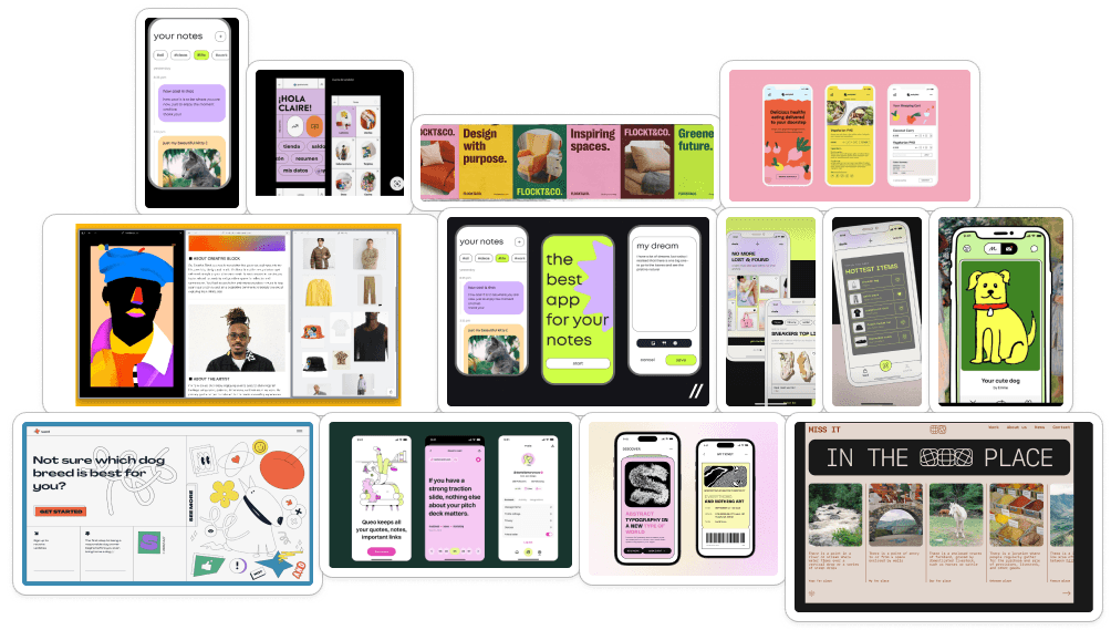
Moodboard for our visual design system
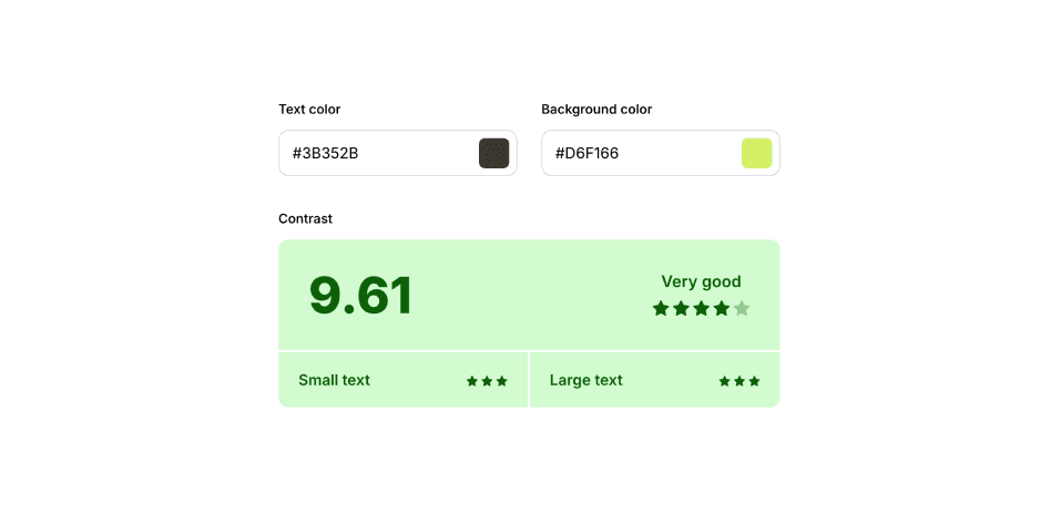
Accessibility check
Design system colors, typography, and assets

Moodboard for our visual design system

Accessibility check
User Testing
Let's Iterate!
Throughout the entire design process, I strive to ensure every product decision is backed with deliberation and reasoning, and I hope that my passion for creating comes through as users engage with the app. Among many iterations, there are 3 key design explorations, backed by A/B testing, that I'd like to highlight.
Tweaking the navbar (again…)
After the initial navbar change from our low-fi testing, we were satisfied with the navbar's appearance and function… But further A/B testing showed us that users were still unsatisfied by the navbar—it seemed "empty" and externally inconsistent with other apps.
"Okay not sure what the buttons mean… also why are they so big? it's distracting"
"Now there's not enough emphasis…"
Just right!
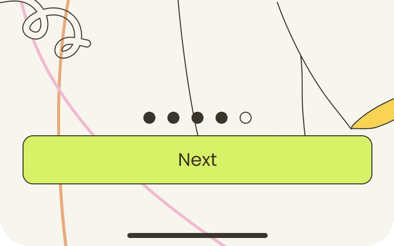
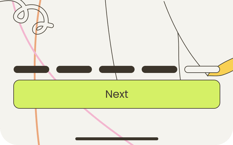
How can I upkeep visibility of the system status during onboarding?
Onboarding is the user's first impression of the app and an essential element for user retention. Guaranteeing that the user is visible of the system status (ie. number of steps) is vital for a smooth and reassuring experience. Here I analyze progress bars and input form labels.
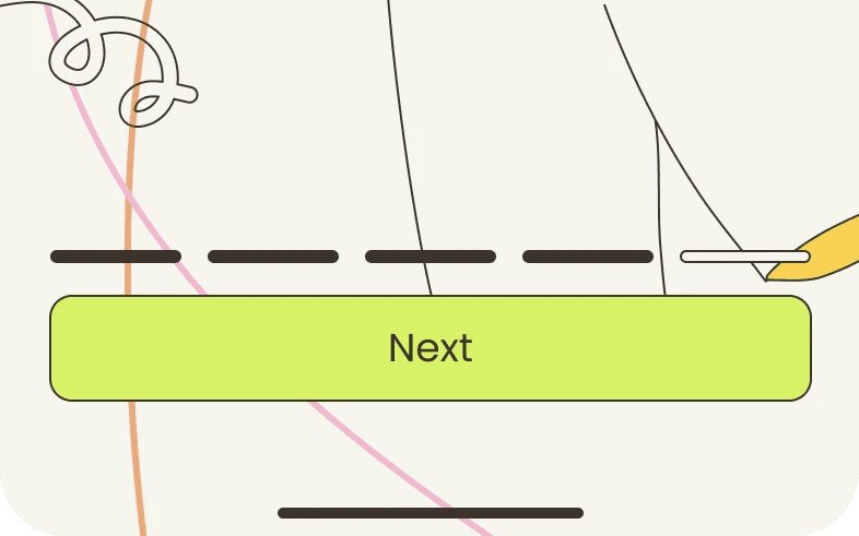
This is better!
Thick bars are distracting from the main content
Dots could be mistaken for an interactable carousel
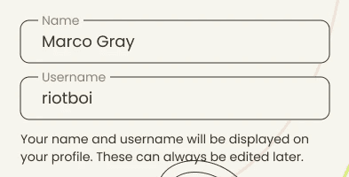
Cross checking inputs is critical for users to make sure their inputs are submitted in the correct areas. Our first design, where labels disappear after the input field is filled, is problematic since it forces users to use memory to recall what the labels were.
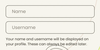
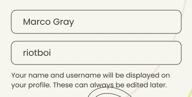
"Wait… which field was which again?"
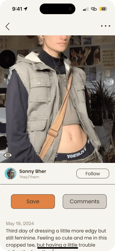
How can I format information hierarchy to intuitively organize the posts screen?
Option 1
Information Clarity
Medium High
Consistency
Medium High
Effectively draws attention to CTA by using large buttons, but users reported the lack of content on the top bar to be slightly awkward.
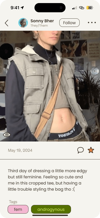
Option 2
Information Clarity
Low
Consistency
Medium
This was one of our first iterations, but user testing showed us that the icons were insufficient for a CTA, and too much emphasis is placed on the date of the post.
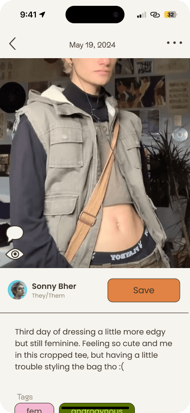
Option 3
Information Clarity
Medium Low
Consistency
Medium High
The CTA for saving a post is clear, but severely lacks for the comment option. Users also expected a follow button to be next to the name instead of the save CTA.
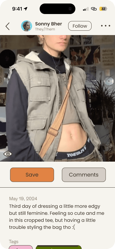
Option 4
Information Clarity
High
Consistency
Medium High
The CTA clearly emphasizes both Save and Comments, clearly indicating the main courses of action. The previously awkward empty space on top is now filled with the poster's info and a follow option.
The information hierarchy on the posts screen plays a crucial role in how users interact with the app. I needed to ensure it was structured logically, allowing users to easily navigate content while maintaining consistency with the overall design system.

Option 1
Information Clarity
Medium High
Consistency
Medium High
Effectively draws attention to CTA by using large buttons, but users reported the lack of content on the top bar to be slightly awkward.

Option 2
Information Clarity
Low
Consistency
Medium
This was one of our first iterations, but user testing showed us that the icons were insufficient for a CTA, and too much emphasis is placed on the date of the post.

Option 3
Information Clarity
Medium Low
Consistency
Medium High
The CTA for saving a post is clear, but severely lacks for the comment option. Users also expected a follow button to be next to the name instead of the save CTA.

Option 4
Information Clarity
High
Consistency
Medium High
The CTA clearly emphasizes both Save and Comments, clearly indicating the main courses of action. The previously awkward empty space on top is now filled with the poster's info and a follow option.

Final Figma Screens
Onboarding
Informative and stylish tutorial on Flair
Home
View a mosaic of suggested fits & fun
Posts
Share your fashion journey & save fits
Products
View tagged items and shop related
Profile
View fashion timeline and organize fits


The final prototype
Let's help you find your style :)
to navigate proto
to restart
The Conclusion
Reflection and future explorations
Flair was one of my very first UX projects, and it’ll always have a special place in my heart. After over 48 sleepless hours, it was all totally worth it! Here are a few lessons I’ve picked up along the way and some areas I’d love to refine.
Lessons Learned
Over-Reliance on Algorithms: We leaned too much on algorithms, assuming users would generate quality content and wouldn’t be bigoted. While we had safeguards, focusing more on user groups and personas from the start could have refined this.
Too Broad: The app became too much of a generalist—too many features without enough depth. Our goal to address multiple pain points spread us thin, leading to solutions that could apply to any fashion group, not just trans individuals. Depth over breadth would have created a more focused experience.
Design Process Hiccups: The limited time caused rushed organization, making it difficult to track iterations. In hindsight, we could’ve benefited from more mid-fi and lo-fi wireframes for testing and refining, improving iteration flow.
Feature Prioritization: With more time, an Effort vs. Impact matrix could’ve helped us narrow down on the core features that matter most. The design became messy at times, and clearer prioritization would have led to more cohesive results.
Learning: I really enjoyed using Framer to create this case study, and it taught me the importance of balancing feature scope with user needs.
Future Explorations
Moving forward, I’d love to explore:
What would happen if we focused on fewer, high-impact features tailored specifically towards people undergoing a transition?
How could we improve retention, ensuring users find continuous value and feel safe coming back regularly?
How might we incorporate more community-driven features, allowing users to share advice, styling tips, and support?
Thank you for reading! :)
Case Study
Design Sprint
Flair
Expressing gender identity, one outfit at a time.
Roles
UX Designer
UX Researcher
Full-Stack Designer
Timeline
48 hours (May 17 – 19, 2024)
Team
Alexis Chew
Richie Sarinana
Owen Payton
Awards
UCI Designathon 2024, 2nd Place
In Spring 2024, I participated in UC Irvine's annual Designathon, where the design prompt challenged us to create an app that fosters creative expression for a more inclusive society. Our team's solution, Flair—a fashion app for transgender and genderqueer identities—stood out among over 200 competitors, earning us 2nd place.
The Context
For many transgender and genderqueer individuals, fashion is way more than just clothing—it's a vital expression of their identity and a way to navigate the world.
Yet, finding clothing that truly resonates with their sense of self can be challenging in a landscape dominated by heteronormative standards.
This project was born from our shared experiences in the queer community and the struggle to find fashion spaces that truly celebrate and affirm our identities.
The Problem
How can we empower transgender and non-binary individuals to explore and express their identities through fashion in a safe and affirming digital space?
The broad, no-brainer goals that guided our design
Emphasis on inclusivity-forward representation.
Discouragement of bigotry and discrimination.
The Research
Understanding our users and the problem space
Research Procedures
We listened to 20+ genderqueer people… and their frustration is undeniable
Through 25 user surveys and 3 user interviews, we received input from people from all across the queer gender spectrum to learn more about their experiences and challenges with finding fashion inspiration, how their fashion goals relate to their identity, and what features they would search for in our application.
User Survey Statistics
After quantifying grievances, we find that…
76%
struggle to find accurate brand, price, or availability of products
64%
struggle with where to start when exploring new styles
80%
want to document outfits over time & track their evolving style
User Interviews
A conversation with three trans people
Here are the common behavioral patterns we identified:
Frustrated by: A lack of trans-inclusive fashion platforms, along with algorithms that fail to protect against transphobia, making it harder to find affirming clothing and leading to user disengagement.
Motivated by: The desire to express their evolving identities through gender affirming clothing and connect with a likeminded community.
"One time I opened up a magazine site and it straight up crashed my browser. I just didn’t bother trying again."
"Don’t be boring! Nowadays, every website is so obviously a template."
Research Synthesis

Sorting through the notes, quotes, observations, and research data by creating an affinity map.
Secondary Analysis
Currently, there isn't an efficient solution
One of the main platforms for fashion inspiration is Instagram: a popular but algorithm-driven platform that often overlooks queer and trans fashion. Analyzing competitors revealed that mainstream apps prioritize reach over inclusivity, leaving trans users without tailored experiences.

Competitive analysis on similar apps used for queer fashion discovery.
Summary
Key insights… much to think about!
Challenges in Finding Affirming Clothing
Trans and genderqueer individuals struggle with limited inclusive options along with a lack of price and product transparency, making it difficult to find clothing that truly reflects their identity.
Lack of Inspiration and Starting Points
Users often feel lost when exploring new styles, lacking clear guidance or resources to help them begin their fashion journey.
Unsafe and Unwelcoming Mainstream Platforms
Unchecked transphobia and a lack of tailored experiences on mainstream platforms lead to disengagement and frustration, leaving users without safe, affirming digital spaces.
The Design
Encapsulating our research into a streamlined experience
User Journey Map
Mapping the user flow
Based on the research, trans and genderqueer individuals prioritize product and style discovery along with outfit documentation. Thus, the main processes of the user journey consist of a personalized onboarding process, then viewing a product, creating a post or collection, and viewing your timeline or collections.

A user flow diagram documenting the core features and pages of the app.
Low Fidelity Wireframes
Starting from square one
I narrowed in on the home, profile, and post screens at this stage and wanted to gather external feedback early. I asked users to navigate the prototype with guidance to observe:
Whether the layout felt intuitive
If there were features or information they thought were lacking
How they felt navigating the screens

Takeaways
Positive: The overall layout was received well and users said that it seemed intuitive.
Negative: Users didn't like the multiple options in the navbar and would prefer something simpler and more straightforward. The amount of options was overwhelming, especially in a new app environment.
Thus, we decided to opt for a simpler navbar design. Talking to our testers, they informed us that fewer options meant the app felt cleaner and less daunting.
Before
After
After
Branding and Design System
A playful approach to fashion
Drawing inspiration from soft, pastel tones reminiscent (but not too on the nose) of pride flag colors, we crafted an accessible design system that feels welcoming, playful, and positive. The color palette sets a light-hearted mood, while the copy is affirming, casual, and encouraging.
Click arrows or swipe to navigate carousel
Design system colors, typography, and assets

Moodboard for our visual design system

Accessibility check
Design system colors, typography, and assets

Moodboard for our visual design system

Accessibility check
User Testing
Let's Iterate!
Throughout the entire design process, I strive to ensure every product decision is backed with deliberation and reasoning, and I hope that my passion for creating comes through as users engage with the app. Among many iterations, there are 3 key design explorations, backed by A/B testing, that I'd like to highlight.
Tweaking the navbar (again…)
After the initial navbar change from our low-fi testing, we were satisfied with the navbar's appearance and function… But further A/B testing showed us that users were still unsatisfied by the navbar—it seemed "empty" and externally inconsistent with other apps.
"Okay not sure what the buttons mean… also why are they so big? it's distracting"
"Now there's not enough emphasis…"
Just right!
How can I upkeep visibility of the system status during onboarding?
Onboarding is the user's first impression of the app and an essential element for user retention. Guaranteeing that the user is visible of the system status (ie. number of steps) is vital for a smooth and reassuring experience. Here I analyze progress bars and input form labels.


Thick bars are distracting from the main content
Dots could be mistaken for an interactable carousel

This is better!
Cross checking inputs is critical for users to make sure their inputs are submitted in the correct areas. Our first design, where labels disappear after the input field is filled, is problematic since it forces users to use memory to recall what the labels were.


"Wait… which field was which again?"

How can I format information hierarchy to intuitively organize the posts screen?

Option 1
Information Clarity
Medium High
Consistency
Medium High
Effectively draws attention to CTA by using large buttons, but users reported the lack of content on the top bar to be slightly awkward.

Option 2
Information Clarity
Low
Consistency
Medium
This was one of our first iterations, but user testing showed us that the icons were insufficient for a CTA, and too much emphasis is placed on the date of the post.

Option 3
Information Clarity
Medium Low
Consistency
Medium High
The CTA for saving a post is clear, but severely lacks for the comment option. Users also expected a follow button to be next to the name instead of the save CTA.

Option 4
Information Clarity
High
Consistency
Medium High
The CTA clearly emphasizes both Save and Comments, clearly indicating the main courses of action. The previously awkward empty space on top is now filled with the poster's info and a follow option.
The information hierarchy on the posts screen plays a crucial role in how users interact with the app. I needed to ensure it was structured logically, allowing users to easily navigate content while maintaining consistency with the overall design system.

Option 1
Information Clarity
Medium High
Consistency
Medium High
Effectively draws attention to CTA by using large buttons, but users reported the lack of content on the top bar to be slightly awkward.

Option 2
Information Clarity
Low
Consistency
Medium
This was one of our first iterations, but user testing showed us that the icons were insufficient for a CTA, and too much emphasis is placed on the date of the post.

Option 3
Information Clarity
Medium Low
Consistency
Medium High
The CTA for saving a post is clear, but severely lacks for the comment option. Users also expected a follow button to be next to the name instead of the save CTA.

Option 4
Information Clarity
High
Consistency
Medium High
The CTA clearly emphasizes both Save and Comments, clearly indicating the main courses of action. The previously awkward empty space on top is now filled with the poster's info and a follow option.

Final Figma Screens
Onboarding
Informative and stylish tutorial on Flair
Home
View a mosaic of suggested fits & fun
Posts
Share your fashion journey & save fits
Products
View tagged items and shop related
Profile
View fashion timeline and organize fits


The final prototype
Let's help you find your style :)
to navigate proto
to restart
The Conclusion
Reflection and future explorations
Flair was one of my very first UX projects, and it’ll always have a special place in my heart. After over 48 sleepless hours, it was all totally worth it! Here are a few lessons I’ve picked up along the way and some areas I’d love to refine.
Lessons Learned
Over-Reliance on Algorithms: We leaned too much on algorithms, assuming users would generate quality content and wouldn’t be bigoted. While we had safeguards, focusing more on user groups and personas from the start could have refined this.
Too Broad: The app became too much of a generalist—too many features without enough depth. Our goal to address multiple pain points spread us thin, leading to solutions that could apply to any fashion group, not just trans individuals. Depth over breadth would have created a more focused experience.
Design Process Hiccups: The limited time caused rushed organization, making it difficult to track iterations. In hindsight, we could’ve benefited from more mid-fi and lo-fi wireframes for testing and refining, improving iteration flow.
Feature Prioritization: With more time, an Effort vs. Impact matrix could’ve helped us narrow down on the core features that matter most. The design became messy at times, and clearer prioritization would have led to more cohesive results.
Learning: I really enjoyed using Framer to create this case study, and it taught me the importance of balancing feature scope with user needs.
Future Explorations
Moving forward, I’d love to explore:
What would happen if we focused on fewer, high-impact features tailored specifically towards people undergoing a transition?
How could we improve retention, ensuring users find continuous value and feel safe coming back regularly?
How might we incorporate more community-driven features, allowing users to share advice, styling tips, and support?
Thank you for reading! :)
You've gotten this far, check out another project!
Let's Connect!
Let's Connect!
Case Study
Design Sprint
Flair
Expressing gender identity, one outfit at a time.
Roles
UX Designer
UX Researcher
Full-Stack Designer
Timeline
48 hours (May 17 – 19, 2024)
Team
Alexis Chew
Richie Sarinana
Owen Payton
Awards
UCI Designathon 2024, 2nd Place
In Spring 2024, I participated in UC Irvine's annual Designathon, where the design prompt challenged us to create an app that fosters creative expression for a more inclusive society. Our team's solution, Flair—a fashion app for transgender and genderqueer identities—stood out among over 200 competitors, earning us 2nd place.
The Context
For many transgender and genderqueer individuals, fashion is way more than just clothing—it's a vital expression of their identity and a way to navigate the world.
Yet, finding clothing that truly resonates with their sense of self can be challenging in a landscape dominated by heteronormative standards.
This project was born from our shared experiences in the queer community and the struggle to find fashion spaces that truly celebrate and affirm our identities.
The Problem
How can we empower transgender and non-binary individuals to explore and express their identities through fashion in a safe and affirming digital space?
The broad, no-brainer goals that guided our design
Emphasis on inclusivity-forward representation.
Discouragement of bigotry and discrimination.
The Research
Understanding our users and the problem space
Research Procedures
We listened to 20+ genderqueer people… and their frustration is undeniable
Through 25 user surveys and 3 user interviews, we received input from people from all across the queer gender spectrum to learn more about their experiences and challenges with finding fashion inspiration, how their fashion goals relate to their identity, and what features they would search for in our application.
User Survey Statistics
After quantifying grievances, we find that…
76%
struggle to find accurate brand, price, or availability of products
64%
struggle with where to start when exploring new styles
80%
want to document outfits over time & track their evolving style
User Interviews
A conversation with three trans people
Here are the common behavioral patterns we identified:
Frustrated by: A lack of trans-inclusive fashion platforms, along with algorithms that fail to protect against transphobia, making it harder to find affirming clothing and leading to user disengagement.
Motivated by: The desire to express their evolving identities through gender affirming clothing and connect with a likeminded community.
"One time I opened up a magazine site and it straight up crashed my browser. I just didn’t bother trying again."
"Don’t be boring! Nowadays, every website is so obviously a template."
Research Synthesis

Sorting through the notes, quotes, observations, and research data by creating an affinity map.
Secondary Analysis
Currently, there isn't an efficient solution
One of the main platforms for fashion inspiration is Instagram: a popular but algorithm-driven platform that often overlooks queer and trans fashion. Analyzing competitors revealed that mainstream apps prioritize reach over inclusivity, leaving trans users without tailored experiences.

Competitive analysis on similar apps used for queer fashion discovery.
Summary
Key insights… much to think about!
Challenges in Finding Affirming Clothing
Trans and genderqueer individuals struggle with limited inclusive options along with a lack of price and product transparency, making it difficult to find clothing that truly reflects their identity.
Lack of Inspiration and Starting Points
Users often feel lost when exploring new styles, lacking clear guidance or resources to help them begin their fashion journey.
Unsafe and Unwelcoming Mainstream Platforms
Unchecked transphobia and a lack of tailored experiences on mainstream platforms lead to disengagement and frustration, leaving users without safe, affirming digital spaces.
The Design
Encapsulating our research into a streamlined experience
User Journey Map
Mapping the user flow
Based on the research, trans and genderqueer individuals prioritize product and style discovery along with outfit documentation. Thus, the main processes of the user journey consist of a personalized onboarding process, then viewing a product, creating a post or collection, and viewing your timeline or collections.

A user flow diagram documenting the core features and pages of the app.
Low Fidelity Wireframes
Starting from square one
I narrowed in on the home, profile, and post screens at this stage and wanted to gather external feedback early. I asked users to navigate the prototype with guidance to observe:
Whether the layout felt intuitive
If there were features or information they thought were lacking
How they felt navigating the screens

Takeaways
Positive: The overall layout was received well and users said that it seemed intuitive.
Negative: Users didn't like the multiple options in the navbar and would prefer something simpler and more straightforward. The amount of options was overwhelming, especially in a new app environment.
Thus, we decided to opt for a simpler navbar design. Talking to our testers, they informed us that fewer options meant the app felt cleaner and less daunting.
Before
After
After
Branding and Design System
A playful approach to fashion
Drawing inspiration from soft, pastel tones reminiscent (but not too on the nose) of pride flag colors, we crafted an accessible design system that feels welcoming, playful, and positive. The color palette sets a light-hearted mood, while the copy is affirming, casual, and encouraging.
Click arrows or swipe to navigate carousel
Design system colors, typography, and assets

Moodboard for our visual design system

Accessibility check
Design system colors, typography, and assets

Moodboard for our visual design system

Accessibility check
User Testing
Let's Iterate!
Throughout the entire design process, I strive to ensure every product decision is backed with deliberation and reasoning, and I hope that my passion for creating comes through as users engage with the app. Among many iterations, there are 3 key design explorations, backed by A/B testing, that I'd like to highlight.
Tweaking the navbar (again…)
After the initial navbar change from our low-fi testing, we were satisfied with the navbar's appearance and function… But further A/B testing showed us that users were still unsatisfied by the navbar—it seemed "empty" and externally inconsistent with other apps.
"Okay not sure what the buttons mean… also why are they so big? it's distracting"
"Now there's not enough emphasis…"
Just right!
How can I upkeep visibility of the system status during onboarding?
Onboarding is the user's first impression of the app and an essential element for user retention. Guaranteeing that the user is visible of the system status (ie. number of steps) is vital for a smooth and reassuring experience. Here I analyze progress bars and input form labels.

Dots could be mistaken for an interactable carousel

This is better!

Thick bars are distracting from the main content
Cross checking inputs is critical for users to make sure their inputs are submitted in the correct areas. Our first design, where labels disappear after the input field is filled, is problematic since it forces users to use memory to recall what the labels were.


"Wait… which field was which again?"

How can I format information hierarchy to intuitively organize the posts screen?

Option 1
Information Clarity
Medium High
Consistency
Medium High
Effectively draws attention to CTA by using large buttons, but users reported the lack of content on the top bar to be slightly awkward.

Option 2
Information Clarity
Low
Consistency
Medium
This was one of our first iterations, but user testing showed us that the icons were insufficient for a CTA, and too much emphasis is placed on the date of the post.

Option 3
Information Clarity
Medium Low
Consistency
Medium High
The CTA for saving a post is clear, but severely lacks for the comment option. Users also expected a follow button to be next to the name instead of the save CTA.

Option 4
Information Clarity
High
Consistency
Medium High
The CTA clearly emphasizes both Save and Comments, clearly indicating the main courses of action. The previously awkward empty space on top is now filled with the poster's info and a follow option.
The information hierarchy on the posts screen plays a crucial role in how users interact with the app. I needed to ensure it was structured logically, allowing users to easily navigate content while maintaining consistency with the overall design system.

Option 1
Information Clarity
Medium High
Consistency
Medium High
Effectively draws attention to CTA by using large buttons, but users reported the lack of content on the top bar to be slightly awkward.

Option 2
Information Clarity
Low
Consistency
Medium
This was one of our first iterations, but user testing showed us that the icons were insufficient for a CTA, and too much emphasis is placed on the date of the post.

Option 3
Information Clarity
Medium Low
Consistency
Medium High
The CTA for saving a post is clear, but severely lacks for the comment option. Users also expected a follow button to be next to the name instead of the save CTA.

Option 4
Information Clarity
High
Consistency
Medium High
The CTA clearly emphasizes both Save and Comments, clearly indicating the main courses of action. The previously awkward empty space on top is now filled with the poster's info and a follow option.

Final Figma Screens
Onboarding
Informative and stylish tutorial on Flair
Home
View a mosaic of suggested fits & fun
Posts
Share your fashion journey & save fits
Products
View tagged items and shop related
Profile
View fashion timeline and organize fits


The final prototype
Let's help you find your style :)
to navigate proto
to restart
The Conclusion
Reflection and future explorations
Flair was one of my very first UX projects, and it’ll always have a special place in my heart. After over 48 sleepless hours, it was all totally worth it! Here are a few lessons I’ve picked up along the way and some areas I’d love to refine.
Lessons Learned
Over-Reliance on Algorithms: We leaned too much on algorithms, assuming users would generate quality content and wouldn’t be bigoted. While we had safeguards, focusing more on user groups and personas from the start could have refined this.
Too Broad: The app became too much of a generalist—too many features without enough depth. Our goal to address multiple pain points spread us thin, leading to solutions that could apply to any fashion group, not just trans individuals. Depth over breadth would have created a more focused experience.
Design Process Hiccups: The limited time caused rushed organization, making it difficult to track iterations. In hindsight, we could’ve benefited from more mid-fi and lo-fi wireframes for testing and refining, improving iteration flow.
Feature Prioritization: With more time, an Effort vs. Impact matrix could’ve helped us narrow down on the core features that matter most. The design became messy at times, and clearer prioritization would have led to more cohesive results.
Learning: I really enjoyed using Framer to create this case study, and it taught me the importance of balancing feature scope with user needs.
Future Explorations
Moving forward, I’d love to explore:
What would happen if we focused on fewer, high-impact features tailored specifically towards people undergoing a transition?
How could we improve retention, ensuring users find continuous value and feel safe coming back regularly?
How might we incorporate more community-driven features, allowing users to share advice, styling tips, and support?
